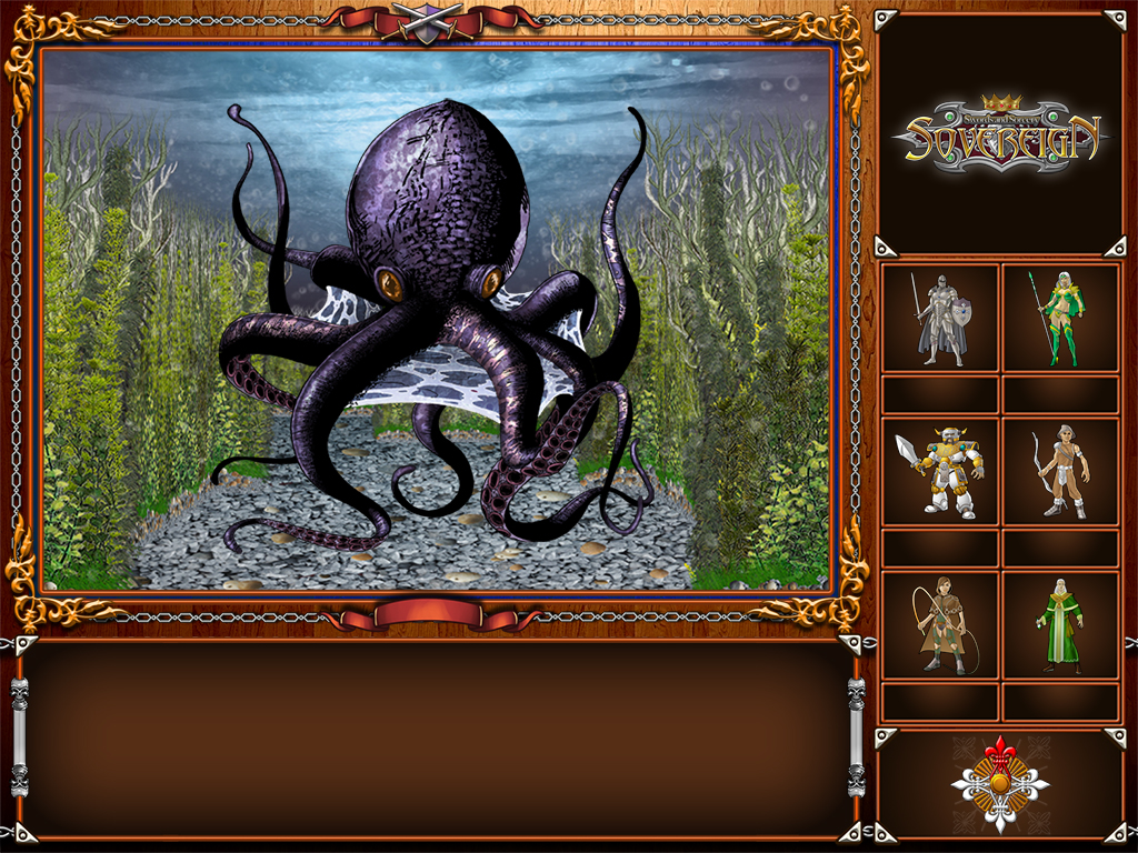
Following up on the not so popular poll (it isn’t too late though ;)) inviting players to weigh in on GUI design decisions, as well as a lengthier discussion on this subject on RPGCodex, here is the current state of affairs concerning the traditional version of the GUI.
And a big revelation on just how open the world will be 😉


Definitely vote for the traditional look. I think that is awesome, and makes me want to jump right in and start carving up that octopod.
@Dorateen Well… That IS the intended effect 🙂